THC Nomad Logo Refinement
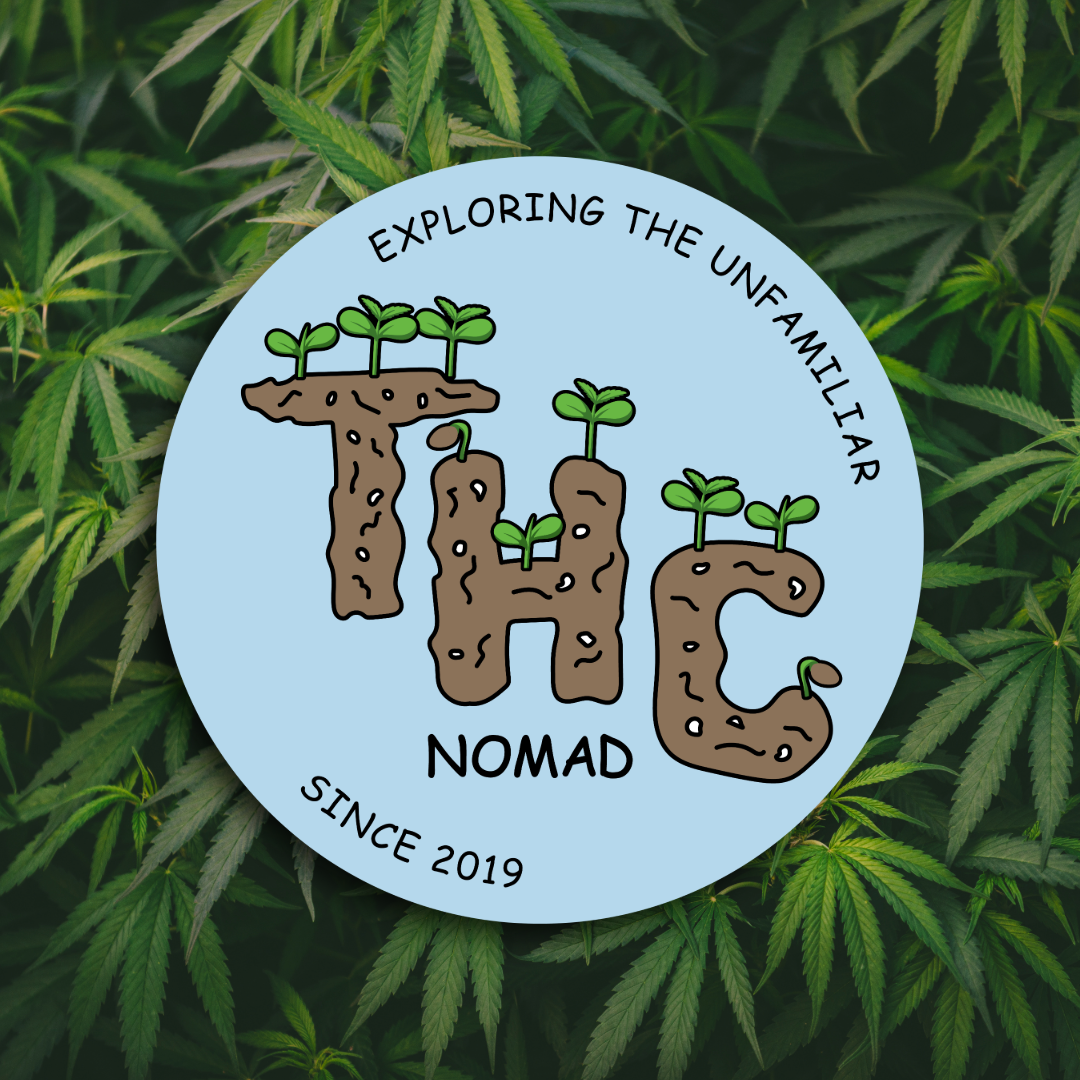
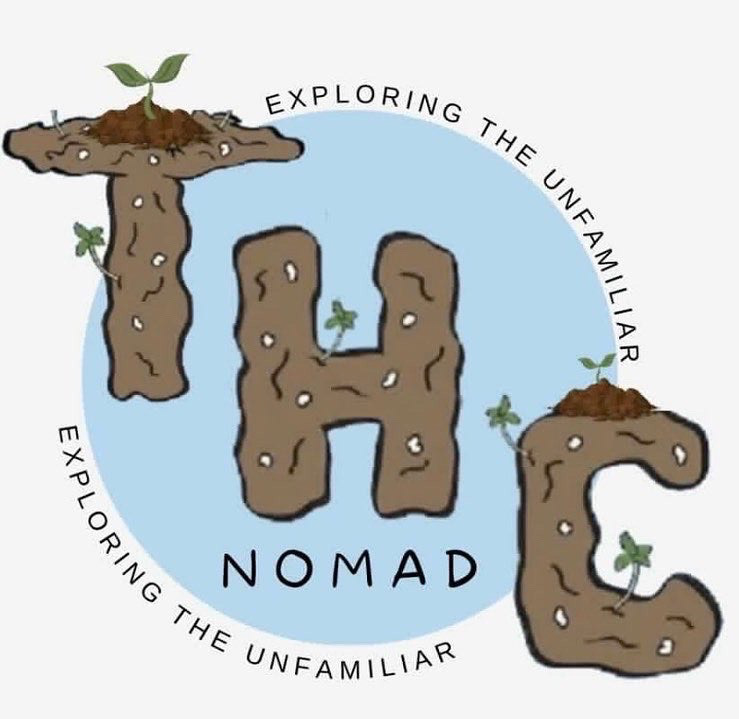
For this project, I partnered with a local brand, THC Nomad, to refine their existing logo. The goal was to keep the original spirit of the design while enhancing its clarity and versatility. I focused on cleaning up the lines, improving scalability, and ensuring the logo could be easily used across different packaging and label formats.
What I Did
Refinement: Streamlined the existing logo elements to create a cleaner look.
Versatility: Adjusted the design so it could be used seamlessly on jar labels and other product packaging.
Consistency: Maintained the brand’s core identity while enhancing overall readability.
Original Logo
New Logo